Logo Redesign: How to Modernise Without Losing Recognition
A practical guide to updating an established logo while protecting the visual cues customers already recognise.
On this page
- What is a logo redesign?
- Why can an established logo feel dated?
- What should you keep during a logo redesign?
- How do you modernise a logo without losing recognition?
- Which risk checks should you run before launch?
- Should you tell customers about the logo change?
- How much does a logo redesign cost?
- Common logo redesign mistakes to avoid
- A practical decision checklist
- The decision to make
A successful logo redesign makes an established business easier to recognise and trust, not simply more fashionable. Start by identifying the colours, shapes and letterforms people already associate with you, then modernise the parts that limit clarity, legibility or use across today’s touchpoints. If you are considering a professional logo redesign, treat it as a business decision with clear tests, not a vote on which concept looks nicest.
A logo can look dated and still hold valuable recognition. The task is to understand which elements are doing useful work before changing them. This guide explains how to audit those elements, improve practical performance and reduce the risk of confusing existing customers.
What is a logo redesign?
A logo redesign is a planned change to a business’s visual mark, wordmark or both. It can range from a careful refinement of the existing design to a new identity built around a different strategy. The right level of change depends on what is no longer working and what customers already recognise.
A logo is not the whole brand. It is one visual identifier within a wider system that can include colour, typography, photography, language and layout. A new logo may help a business look clearer and more current, but it cannot fix an unclear service, poor customer experience or inconsistent marketing on its own.
It helps to separate three common terms:
- Logo tidy-up: Small production fixes, such as correcting spacing or creating clean vector artwork, with little visible change.
- Logo refresh: A controlled update that keeps the main idea recognisable while improving details such as type, proportion or colour application.
- Logo redesign: A broader change to the composition, symbol, typography or visual idea. It may still preserve familiar assets, but it changes more than surface details.
These terms are not regulated categories. Different designers use them differently, so ask what the proposed scope means in practice. Will the core symbol stay? Is the name changing? Are you receiving logo files only, or a wider identity system with rules for using the logo?
A refresh may be enough when the business is sound but the artwork is clumsy or difficult to use. A deeper redesign may be justified when the business has changed direction, the existing mark is difficult to distinguish, or it cannot work reliably across the places customers now meet it. The goal is not to modernise for its own sake. It is to remove a real obstacle without discarding recognition that still helps the business.
Why can an established logo feel dated?
A logo often feels dated because the visual conventions around it have changed, or because it was made for a different set of uses. Older marks may rely on very thin lines, detailed illustrations, tiny straplines, bevels, shadows or several effects layered together. Those details can be attractive on a large printed sign but hard to read when the logo is small or viewed quickly.
The business may also have outgrown the identity. A name or symbol that once suited a single local service might feel restrictive after adding new services, locations or customer groups. Sometimes the problem is not the logo itself but the system around it: the logo is stretched, recoloured, placed on busy backgrounds or paired with inconsistent fonts.
Before deciding the logo is the problem, collect examples of how it currently appears. Check:
- Your website header, mobile menu and browser tab icon.
- Social profile pictures and post templates.
- Quotes, invoices, email signatures and presentation covers.
- Signage, uniforms, packaging, vehicles or product labels, if relevant.
- Search results and directory listings where your mark appears beside competitors.
Look for specific failures. Does the name disappear at small sizes? Are the details filling in on embroidery? Does the artwork look blurred because someone is enlarging a small image? Is the design too wide for a compact website header? These are useful reasons to explore a redesign because they describe a job the new design needs to do.
By contrast, “I’m bored of it” is a feeling worth noting, but not enough by itself to justify removing distinctive elements. Owners see their logo far more often than most customers do. A design can feel familiar to you while still being a useful recognition cue to the people who buy from you.
What should you keep during a logo redesign?
Keep the elements that customers use to identify your business, unless there is a clear strategic reason to change them. These may include a particular colour, a recognisable outline, a symbol, a distinctive arrangement or a typographic style. Sometimes the valuable asset is not the full logo but one component that appears consistently across your website, packaging and social profiles.
The Ehrenberg-Bass Institute’s explanation of distinctive brand assets describes the importance of visual cues that help people identify a brand. In plain terms, a distinctive asset is a familiar element that can point customers towards your business, even before they read the name. Colour, shape and other repeated cues can all play a part. The practical lesson is to check what people recognise before deciding what to remove.
A simple equity audit can help. “Brand equity” means the value built through people’s awareness, familiarity and associations with your business. For a small business, you do not need an expensive research programme to start examining it. You do need to avoid treating the owner’s preferences as a substitute for customer evidence.
Make a recognition inventory
Write down the logo’s separate ingredients: name, symbol, colour, type style, shape, layout and tagline. For each one, ask:
- Do customers mention or remember this element?
- Does it appear consistently across the business?
- Is it recognisable when used without the rest of the logo?
- Does it distinguish the business from nearby competitors?
- Does it create a practical problem in print, on screen or in production?
If you can, ask a small selection of existing customers what they associate with the business. Show the current logo alongside neutral examples, or ask an open question before showing it. Avoid leading questions such as “You know us by the green icon, don’t you?” That invites agreement rather than useful evidence.
A 2010 study by Michael F. Walsh, Karen Page Winterich and Vikas Mittal examined how brand commitment affects reactions to logo redesign. Its central relevance for a small business is that people who feel strongly connected to a brand may respond differently to a change than casual buyers. Read the research paper on brand commitment and logo redesign before assuming loyal customers will welcome a dramatic change just because the new design looks more contemporary.
That does not mean loyal customers should control every design choice. It means their familiarity is part of the situation you are designing for. Preserve useful recognition while solving the actual design problem.
How do you modernise a logo without losing recognition?
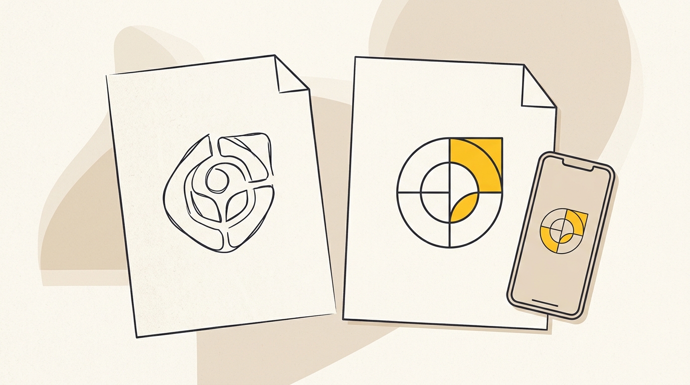
Work in stages. Start with the existing assets, make the smallest changes that solve the identified problems, then test the proposed logo in realistic contexts. A designer should be able to explain why each meaningful change helps legibility, distinction or use, rather than relying on trends or personal taste.
Step 1: Document the current logo and its problems
Gather every version you can find: original vector artwork, old files from suppliers, social avatars and logo variations used by different staff. A vector file stores artwork as paths that can scale cleanly, unlike a small pixel-based image that can blur when enlarged. If nobody can find the master artwork, recreating a clean version may be a sensible first project before changing the design itself.
Record which version is used where and what goes wrong. For example, a small strapline may be unreadable in a profile icon. A fine outline might disappear when printed in one colour. A long horizontal wordmark might not fit a narrow mobile header. These observations form a design brief with a purpose.
Also note what should not change without a strong reason. That might include the company name, a familiar icon, the main colour or a long-established relationship between symbol and wordmark. This is not a promise that those elements can never change. It is a reminder that changing several recognition cues at once makes it harder for customers to connect the new identity with the old one.
Step 2: Choose the scale of change
Ask the designer to show an evolution route as well as any more ambitious routes. An evolution route preserves more of the existing composition while refining the details. A more substantial route may change the symbol or arrangement but still retain a familiar colour or shape. A complete departure changes the central visual idea and needs a much stronger business case.
Compare routes against the brief, not against one another as isolated artworks. If the main problem is poor legibility, a concept that changes the colour, name treatment and symbol may introduce unnecessary risk. If the business has changed its offer so much that the current identity misrepresents it, a larger change may make sense.
A useful rule of thumb is to avoid changing every familiar cue at the same time unless the business intends to break with its past. This is a design principle, not a guaranteed formula for recognition. The right decision depends on what customers actually know and what the company needs to communicate now.
Step 3: Refine shape, spacing and visual weight
A logo’s geometry is its underlying construction: the proportions, curves, angles and spacing that make its shapes feel balanced. Refinement can involve smoothing awkward curves, removing redundant lines, correcting uneven spacing or adjusting the visual weight of a symbol next to the name.
Optical balance means adjusting a design by how it looks to the eye, not only by mathematical measurement. Two letters may be aligned to the same grid yet appear uneven because of their shapes. A rounded letter may need to extend slightly beyond a flat baseline to look level. These adjustments can make a wordmark feel considered and improve clarity without changing its basic character.
Do not simplify automatically. A small notch, unusual angle or imperfect-looking feature may be the detail people remember. Test the symbol in solid black and in one colour. If its distinctive outline remains clear, it may have a useful shape that survives when colour is unavailable. If important meaning depends on multiple effects or tiny details, consider whether those can be reduced without erasing the idea.
Step 4: Improve the typography and name reading
Typography is the design of letters and the way they are arranged. In a logo, it affects personality as well as legibility. A typeface can feel formal, friendly, technical or traditional, but it must still make the business name easy to read in the contexts where customers see it.
Kerning is the adjustment of space between individual letter pairs. Even spacing between every letter does not always look even, because letter shapes create different amounts of empty space. Custom kerning can make a wordmark feel more polished. It cannot rescue a typeface whose letterforms are difficult to distinguish or a layout that is too cramped.
Test the name at a glance. Ask people unfamiliar with the design to read it without explanation. Pay attention to joined letters, unusual ligatures and stylised characters. A ligature is a connection or combined form between letters. It can look elegant, but if a customer reads a different name or set of letters, the design has made recognition harder. Reporting about Kia’s redesigned wordmark, including searches for “KN car”, illustrates why letterform interpretation deserves a real-world check. See The Drive’s report on confusion around the Kia logo and treat the anecdote as a caution, not proof that every stylised wordmark will cause the same problem.
Step 5: Build a responsive logo system
A responsive logo system is a set of related logo versions designed for different sizes and spaces. It is not permission to create several unrelated logos. Each version should keep a clear family resemblance so that the business remains identifiable wherever the design appears.
A practical system may include:
| Version | Typical use | Design question |
|---|---|---|
| Primary logo | Website, proposals, signage | Is the name and symbol clear at the size people will see it? |
| Compact logo | Mobile navigation, narrow layouts | Can the arrangement fit without squeezing the letters? |
| Symbol or monogram | Social avatar, small icon | Is the shape still recognisable without the full name? |
| One-colour version | Stamps, embroidery, simple print | Does it work without effects or colour differences? |
The right set depends on how the business operates. A professional service firm might need a compact mark for a website and a clear version for proposals. A product business may need artwork that works on labels and small packaging. Do not commission versions you have no use for simply because a package lists them.
Test at actual sizes, not just on a large design canvas. Place the logo in a mobile header, a browser tab, a social profile circle and a realistic document. A favicon is the small icon associated with a website in browser tabs or bookmarks. At 16 pixels square, intricate details and small text may not survive. The answer may be a simpler symbol for that context, not shrinking the entire primary logo until it becomes unreadable.
Which risk checks should you run before launch?
A risk check is a repeatable way to spot problems before you replace the old identity everywhere. You do not need complicated testing software. You do need to show people the design in context, avoid explaining it first and record what they actually notice.
Check 1: The silhouette test
Turn both the old and proposed symbols into solid black shapes. Remove colour, gradients and small internal details. Can existing customers still recognise a familiar outline? Does the proposed mark rely on colour to make its meaning clear? This check is most useful when the symbol is an important recognition cue. A wordmark-only logo may not have a meaningful silhouette, so use a different check for it.
Check 2: The small-size test
Export the proposed logo at the sizes where it will be used. Check the smallest size on a normal screen and in a realistic placement, such as a mobile header or profile image. Look for closed counters, which are the enclosed spaces inside letters such as “a” or “o”, and fine lines that merge or disappear. If it does not read, simplify the small-size version or change the layout. Do not assume people will zoom in.
Check 3: The quick-read test
Show a customer or colleague who was not involved in the design the mark briefly, without giving them its backstory. Ask what business name they can read and what kind of business they think it is. This is a practical qualitative test, not a scientifically valid recognition score unless you design a proper study with appropriate sampling and controls.
Listen for misread letters, mistaken industries and personality words that conflict with the brand’s intended position. One person’s reaction is not a verdict. A repeated misunderstanding across several independent viewers is a useful signal to investigate.
Check 4: The context test
Put the logo beside competitors in search results, on the website, against a dark background and in one-colour print. Compare the actual visual conditions, not a polished presentation where every concept has an ideal background and generous space. Ask whether the mark is legible and distinguishable without relying on a large presentation slide.
Check 5: The production test
Send the artwork to the people who will use it: a web developer, printer, sign maker or uniform supplier. Confirm that they can open the files and understand which version to use. A design can look good on screen and still be difficult or costly to reproduce in a particular material. Ask the supplier to flag practical constraints before you approve final artwork.
Do not turn these checks into arbitrary universal pass marks. A percentage threshold such as “70 per cent recognition” has no meaning without a defined sample, method and baseline. For a small business, the useful questions are often more direct: Can people read the name? Do existing customers connect the new mark to the business? Does it work where the old one failed?
Should you tell customers about the logo change?
Yes, if the change is visible enough that customers may wonder whether the business has changed ownership, direction or quality. Explain what is changing and why in plain language. Keep the story factual: perhaps the logo has been adapted for clearer use across mobile screens, or the visual identity has been updated to reflect a wider service range.
Do not claim that a redesign will automatically increase sales, trust or recognition. Those outcomes depend on more than the logo, including the offer, customer experience, marketing and execution. Instead, describe the practical improvements you can substantiate, such as improved legibility or versions prepared for different applications.
Plan the rollout so customers see a consistent identity across the places they interact with you. Update key digital touchpoints together where possible: website, email signatures, social profiles and directory listings. An inconsistent transition, where old and new marks appear side by side without explanation, can create doubt about which account or business is genuine.
Physical changes can often be phased. Use up existing stationery or packaging when it is sensible, but do not leave critical customer-facing signs or labels in a confusing state. Make a list of assets, owners and update dates. A short rollout plan helps prevent the new logo from appearing on social media while old artwork remains on proposals, invoices and staff uniforms for months.
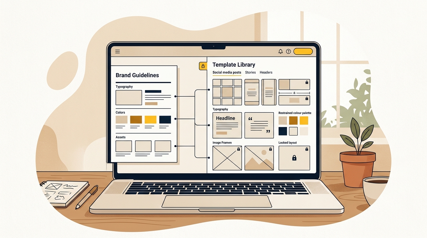
For a larger identity change, make sure the logo is supported by a coherent system. Brand identity design can cover how the logo works with colour, typography, image style and layouts. A brand guidelines document can show staff and suppliers how to use the identity consistently, including which version to choose and which alterations to avoid.
How much does a logo redesign cost?
The price depends on the scope, research, number of concepts, revisions, deliverables and whether the work includes a wider identity system. A vector redraw is a smaller job than a strategy-led redesign with asset research, responsive versions, guidelines and rollout support. Compare proposals by what you receive and what decisions the designer is responsible for, not by the headline price alone.
The supplied research notes give indicative 2026 benchmarks of roughly A$500 to A$2,000 for low-cost freelance or contest work, A$3,000 to A$10,000 for a specialised studio project and A$15,000 or more for a broader, multi-stakeholder programme. These are market estimates, not verified universal rates or a quote from DesignFIT. Confirm the current scope and fee directly with any provider. For a separate view of Australian brand design pricing, review TDS Australia’s pricing guide.
A lower-cost option may be suitable if you already know what the logo needs and require clean artwork or a small refinement. It may not include customer research, competitor review, responsive versions or guidance for suppliers. A larger studio engagement may include more discovery and rollout work, but only pay for what your business needs.
Before approving a proposal, check whether it specifies:
- The project stages, decision points and expected timeline.
- Who supplies the brief and feedback, and how many revision rounds are included.
- Whether the designer will review existing recognition cues and competitor context.
- Which final formats and colour versions you will receive.
- Whether the scope includes usage guidance or wider brand guidelines.
- Whether printing, implementation, trademark advice or rollout costs are excluded.
Ask what happens if a concept is not approved or the brief changes. A clear agreement prevents surprises and helps you compare a designer, freelancer or studio fairly. If your business needs a wider identity rather than a logo alone, make sure the proposal explains how the work will keep the system consistent across applications.
Common logo redesign mistakes to avoid
Changing everything at once
Changing the symbol, colour, typography and name treatment together makes it harder to preserve familiar cues. It can also make testing less informative because you do not know which change caused a positive or negative reaction. If a gradual evolution is appropriate, retain some valuable elements while improving others.
Choosing a trend over a business need
Minimal marks, geometric type and flat colour are not automatically better. A style that is fashionable today may not suit your customers or communicate the qualities that distinguish your business. Use trends as context, not as the brief.
Testing only with the owner’s team
People who have seen a concept repeatedly become familiar with it. Their feedback can still help with practical use, but it cannot stand in for the reactions of customers who have not seen the design. Include people who know the business and people who do not, and keep their feedback separate.
Designing only for a presentation slide
A logo shown at a large size, on a carefully chosen background, can hide small-scale problems. Test the artwork at realistic sizes and in the production formats that matter. A logo is a working asset, not only a portfolio image.
Treating the logo as the whole rebrand
If the website, language, customer experience and visual materials remain inconsistent, a new logo will have limited effect. Decide whether the business needs an updated mark or a broader identity system, then commission the right scope. Do not expect one graphic to correct every brand issue.
A practical decision checklist
Before you approve a logo redesign, make sure you can answer these questions:
- What specific problem does the current logo create?
- Which existing elements do customers recognise or associate with the business?
- Which elements need to change to solve the problem?
- Can people read the name without explanation?
- Does the logo work at its real sizes and in one colour?
- Is there a compact version for small spaces, if the business needs one?
- Has the design been checked beside competitors and in real applications?
- Do customers understand that the updated identity belongs to the same business?
- Do staff and suppliers know which files to use?
- Is the project scope clear about deliverables, revisions and rollout?
If several answers are unknown, pause before committing to a final concept. The next step may be a discovery and audit phase rather than a full redesign. That can clarify what is worth preserving and reduce the chance of spending on changes that do not solve the business problem.
The decision to make
A good logo redesign is not about making an old mark look young. It is about protecting what customers already recognise while removing real barriers to clarity, consistency and use. Start with evidence, make deliberate design changes, test them in context and plan how the new identity will reach customers.
If you are ready to review your existing logo and define the right scope, explore DesignFIT’s logo design service as your next step.
Key takeaway
Keep the visual cues customers recognise, and change only what is needed to make the logo clearer, more useful and easier to apply.
Questions people ask
When should an established business redesign its logo?
Consider a redesign when the logo is hard to read or reproduce, no longer fits the business, or creates a specific problem across current customer touchpoints. First check whether the issue can be solved with better artwork, consistent use or a small refresh.
What is the difference between a logo refresh and a logo redesign?
A refresh usually keeps the main visual idea and refines details such as typography, spacing or colour use. A redesign makes broader changes to the logo’s composition or concept, although it can still preserve familiar elements.
How can I redesign my logo without losing existing customers?
Identify the colours, shapes or letterforms customers already associate with your business before changing the design. Test the proposed mark with existing customers and make sure they can still connect it to your business without being told what it is.
How often should a business update its logo?
There is no fixed schedule that suits every business. Review the logo when the business, customer needs or ways people encounter it have changed, or when the design causes practical problems.
Should I keep my old logo colours when redesigning?
Keep a familiar colour if customers associate it with your business and it still works for your needs. You can refine its shade or contrast, but test the change in context and do not assume colour alone will preserve recognition.